Tuesday, January 31, 2006

Most Common Decorating Mistakes


Avoid a Decorating Disaster with these simple tips!

Having a master plan is essential to success. Often times a person will purchase an entire furniture grouping because it is what they see in the furniture showroom. If you think about it, that’s how most high ticket furnishings are marketed. Furniture retailers want to sell you a sofa, love-seat, chair, accent tables and all the lamps in a grouping. The reason for this? They make MORE MONEY and the salespeople get to THINK LESS! This is an example of one size fits all decorating. In some situations this is fine, but It usually lacks character and personality. If you want to create a room that is unique and special...
Here is a list of mistakes you can avoid.

Furnishings that do not fit the room.
This is the most important design element and should be addressed first. Many rooms contain too much "stuff" and make the space appear smaller than it actually is. Measure your room and bring the tape measure with you when shopping for large pieces. (Everything looks smaller in the store!)

Poor furniture placement.
Often large pieces are placed too far apart. This does not create a comfortable, cozy conversation area. Consider creating two intimate seating arrangements in a larger room

The room does not function.
Besides looking good you will want to create a space you can live in. You will need to determine how the room is used and if there are any specific needs of family members or pets. Proper traffic flow is essential. You do not want to create a pattern that constantly walks in front of the television!

Artwork hung too high.
This is quite common. Mirrors should never be in a dark corner. Instead place them adjacent a window. Remember what will be reflected and position items appropriately. Too many pictures on the wall. In this case, less is more. Think about what your favorite pieces are and showcase them! Remember it is a good idea to leave one wall void of accessories to create a resting place for the eye.

Improper lighting.
Often not enough light sources. This is common as many people will purchase two matching lamps and think they have decorated! (remember the furniture showroom?) Essential to a properly lit room are General Lighting, Task Lighting and Accent Lighting.

Stuck in a the past.
Unfortunately, many of us are guilty of this. We may have items that were purchased twenty years ago. This is great if your theme is retro but if not, consider a few inexpensive purchases to update the decor.
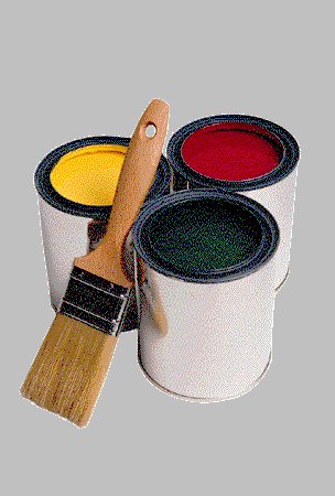
White walls.
Many people have a fear of color. They think that white goes with everything or have the mistaken idea that white walls will make the room appear larger. Don’t be afraid to try a bold paint color. It will dramatically change the feel of the room and enhance the decor.
(see selecting the right paint color)

Good Luck and Happy Decorating!
Author Julie Rieman
Instructor ~The All About Redesign Center
www.allaboutredesign.com

Monday, January 30, 2006

How To Select The Right Paint Color EVERYTIME!


Don’t let your fear of color keep you from having a beautiful home!

Painting and Color Selection are the most important elements of a successful decorating project. I am always somewhat surprised when I walk into a home full of beautiful furnishings and see cold stark white walls! White does not go with everything. In fact, white can detract from your wall decor and quite simply looks cold and sterile. Don’t get me wrong, a white on white theme is gorgeous but most people don’t have all white furnishings! Many of my clients have exquisite taste but are terrified of making the wrong color selection when it comes to paint. I have often wondered why... Have you ever heard of a color phobia? It DOES exist, honest! The medical term is Chromophobia or Chromatophobia. The definition states ~ an abnormal fear of color or colors. Obviously this is felt on your subconscious level and you are completely unaware of it. I often thought some of my clients where just “color challenged.” Now I suspect a few may actually have this strange phobia. Of course it stems from childhood. Apparently there is a reason why we are drawn to specific colors while disliking others. We associate favorite color with happy memories and you can guess the rest. I say, ”who cares! Just pick a color you like!”It doesn't cost a penny. They mix it in the paint for FREE! If you struggle with selecting a palette here are a few quick and simple tips. For different colors within an open floor plan you will want to
Select colors within the same light value. Same position on the color palette.
Paint color to inside or outside corners. Never try to create a break in the wall that does not exist architecturally.
Determine a transition area when using bold color. This could be one wall which is painted a neutral color for the eye to rest. (Remember light values)
For a no-fail monochromatic schemes select color two or three shades away from each other on the palette.
Look very carefully at the darkest color on the palette. This is how you will determine the undertone of EVERY color!
ALWAYS bring home a color sample and view it in the room that will be painted! The color will not appear the same under the fluorescent lights in the store
If you have made a mistake in your selection, take the paint back! Ask that they suggest a way to tone it down.
If your color is too dark, you can mix in white paint yourself. (Be certain it is the same sheen). I hope this information is helpful as you begin your next painting project.
Good luck and Happy Painting!
Author Julie Rieman
Instructor ~The All About Redesign Center
www.allaboutredesign.com

Desperate Housewives Color Palettes... Made Easy!


Love the color in the homes of the Desperate Housewives?

You can include their colors in your next Interior Decorating Project! Benjamen Moore palettes are used...we share the colors with you! You may never watch the show in the same way again!
If you the fear of selecting the wrong color, watch the TV program Desperate Housewives! Many of the colors appear to be soft and muted. This is because they are. Anytime you place a color sample against a white wall (or other background) it is going to seem much more intense. You may pick up these color samples at any location that sells Benjamin Moore Paints. Below is a list of each main characters home color palette. Next time you watch the program, see if you can spot them!

Bree
Hathaway Peach HC-53
Butter Pecan OC-89
Arizona Tan 2162-50
Wythe Blue HC-143
Wickham Gray HC-171
Durango Dust 2165-60

Edie
Northampton Putty HC-89
Shaker Beige HC-45
Mauve Blush 2115-40
Cherry Malt 2104-50
Whisper Violet 2070-70
Touch of Pink 2008-70

Lynette
November Skies 2128-50
Strawberry Yogurt 2104-70
Rose Silk 2104-60
Cherry Malt 2104-50
Melted Ice Cream 2095-70
Beacon Gray 2128-60

Susan
Pink Pearl 2005-60
Hollingsworth Green HC-141
Sweet Salmon 2167-60
Crisp Straw 2157-50
Whisper Violet 2070-70
Provence Creme 2021-60

Gabrielle
Beeswax 2157-40
Acorn Yellow 2161-40
Dark Beige 2165-40
Summer Peach 2167-70
Soft Pumpkin 2166-40
Annapolis Gray RME-70

"Color plays an important role in the show," says Tom Walsh Production Designer for ABC's Desperate Housewives. "We use Universal Studios. Colonial Street for our set on Wisteria Lane, and the houses are basically a Whitman's Sampler of Americana."Walsh says that another benefit to using Benjamin Moore Paints is their durability. "The set is kind of a machine, and it takes a beating over time so it has to be sturdy," explains Walsh. "We need sets that can withstand the wear and tear of the crews and their equipment. All the moving and shaking we need to do to the sets, we can do because we know the paint can withstand it."

Let us know if you would like additional tips in choosing a color palette!
Author Julie Rieman
Instructor ~The All About Redesign Center
www.allaboutredesign.com